NFT & Website Design
Lucky Snails Racing Club

Skills
My Role
Timeline
Interface design
Interactive prototyping
User research & testing
Illustration
Lead Designer
Q4 2021 - Q2 2022
I was the design lead for
Lucky Snails Racing Club (LSRC) - a blockchain-based NFT project that combines playful digital art with interactive gaming mechanics.
What is it?
An NFT project each stored as an ERC-721 token on the Ethereum blockchain.

A blockchain-based NFT project that blends playful digital art with interactive gaming mechanics. It allows users to collect, trade, and race unique digital snails, each stored as an ERC-721 token on the Ethereum blockchain. The project’s visual identity revolves around vibrant, engaging designs and a racing theme.
10,000
320+
Mintable NFTs
Unique Modifcations
Context
The website was designed to serve as a platform where visitors could learn more about the project, join the community, and experience seamless NFT minting. My role was to ensure the website felt welcoming and professional, fostering trust in the project while creating an interface that was intuitive for both experienced NFT enthusiasts and first-time users.
I was approached by the team to create an intuitive and fun experience for users engaging with blockchain technology. From initial discussions, we identified potential usability concerns and decided to address the full picture of user interaction rather than only focusing on visuals.
Improve user engagement metrics, including time spent on the website and community sign-ups.
Ensure a frictionless NFT minting process, reducing user confusion and drop-off rates.
Establish a cohesive visual identity that instills trust and excitement about the project.
Project Goal
Key Metrics
Develop a website experience that achieves the following:
Educates visitors about the LSRC project through clear and concise design.
Encourages users to join the LSRC community by showcasing its unique benefits and vibrant personality.
Simplifies the NFT minting process to make it accessible to users of all experience levels.
Market Analysis
User Research
Studied successful NFT projects like CryptoPunks, Bored Ape Yacht Club to identify effective strategies for engaging and retaining users.
Analyzed trends in blockchain-related websites to ensure accessibility and clarity for users unfamiliar with NFTs.
Conducted surveys and usability tests to identify user expectations for an NFT platform.
Gathered insights into barriers to entry for NFT minting, such as lack of clarity in the process and intimidating blockchain terminology.


Research
Crafting the Vision
Logo Design: Establishing the Brand’s Foundation
Color Palette and Typography: Defining the Brand’s Personality
With the NFTs setting the tone, the next step was to design a logo that encapsulated LSRC’s identity. I focused on creating a logo that was simple yet memorable, incorporating racing elements to tie it back to the project’s theme. The logo served as the foundation for LSRC’s branding, ensuring consistency and recognition across all touchpoints.
Finally, I selected a color palette and typography to bring LSRC’s brand to life:
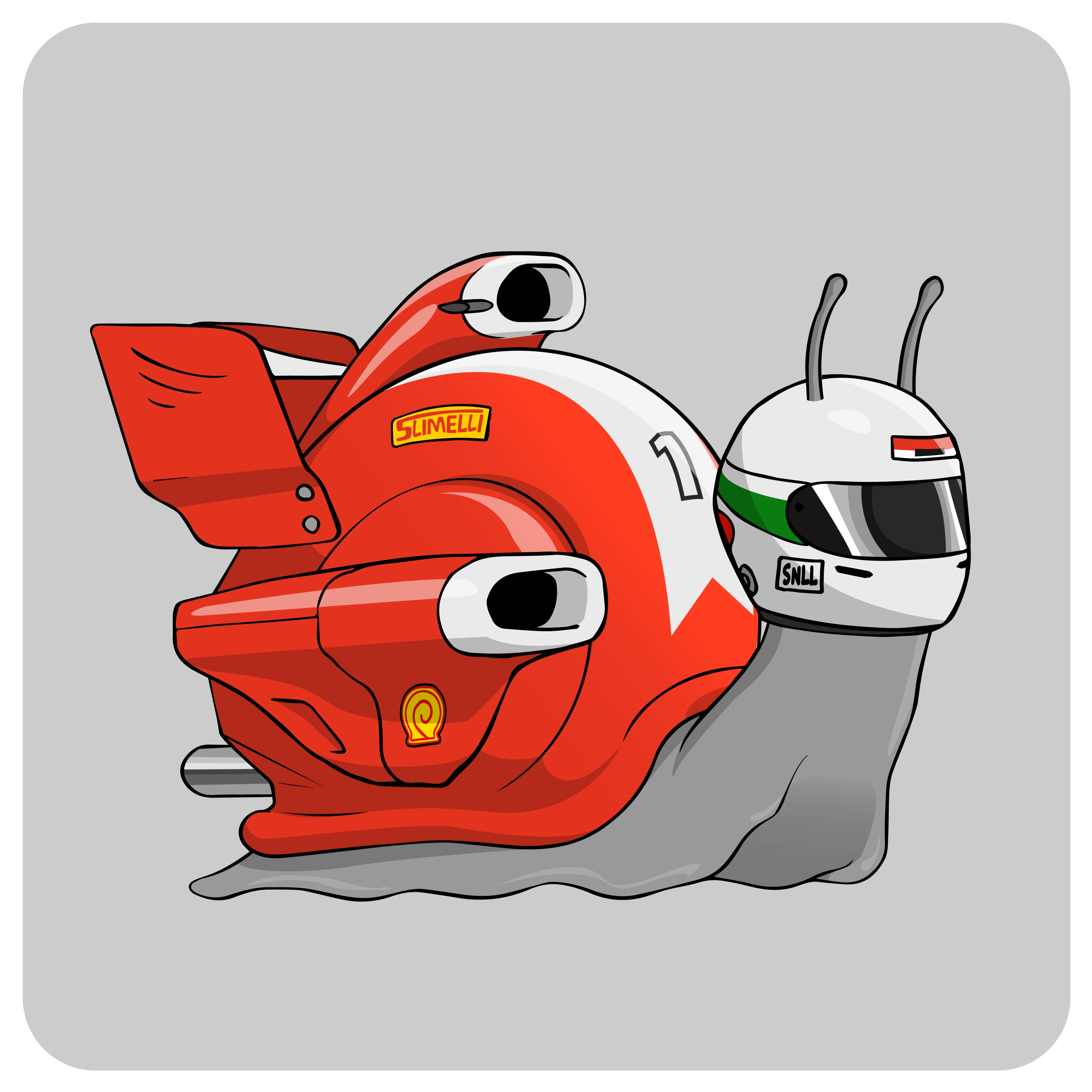
NFT Design: Setting the Tone
In order to keep a consistent branding throughout the entire project, we decided to focus on designing our main product, the NFT. I discussed many different ideas with the founder of the project and the design team. With many ideations and disagreements, we all together reached an idea we liked. A snail racing which is ironic right? We thought it was interesting to take a slow animal and wrap it around with a racing theme.
Designing LSRC’s visual identity was a layered process, starting with the NFTs themselves and building outward into the branding and website. Each element was carefully crafted to reflect LSRC’s playful yet professional personality.
Translucent Background
Text
Header/Highlight Text
#FFF9F1
241F1C
4ADF31
Aa
H1
26
Bold Italic
HERO TEXT
CTA
16
Bold Italic
CTA Text
Text
16
Bold Italic
Body Text
Navigation
12
Bold
Navigation Tabs
Typography
NAME
SIZE
WEIGHT
PURPOSE
Tomorrow
Colors


I chose simple colors to ensure they wouldn't distract from the key elements we wanted to highlight on the website.
I selected a font with a sporty and energetic style, inspired by the typeface used in Formula 1, to evoke a sense of familiarity and excitement.
After several iterations, the team unanimously agreed on this design for its playful yet simple aesthetic, which complements the NFT design without overpowering it.


Home Page
Designed to instantly grab attention, the page features vibrant illustrations closely tied to the project’s theme. It also provides a clear and engaging explanation of what the project is all about.
Minting Page
Provides clear instructions on how to join the whitelist, along with a brief explanation of the minting process. Features an interactive CTA button to encourage users to mint the NFT.

Transparency Page
This page outlines the steps the team will take as specific NFT minting milestones are achieved. By showcasing a clear roadmap, it provides transparency and builds trust with the audience.

Low Fidelity Ideation
After establishing the project's branding, I shifted my focus to designing the website. My goal was to ensure it remained as on-brand as possible while also creating an immersive experience that fully engaged users.
During discussions about the initial Lo-Fi mockups with the design team and founder, we all agreed that the designs felt a bit too plain for the project. While the information we aimed to present was clear and effective, I felt the illustrations could do more to enhance the experience. I wanted visitors to feel immersed and engaged when exploring the website, so I proposed adding dynamic and visually captivating elements to elevate the overall design.
Problems
In these revisions, I collaborated closely with the design team to create illustrations that better aligned with the project’s branding. My vision was to make the website feel like a pitstop during an F1 race, adding energy and excitement to the user experience. To achieve this, I replaced the solid background color with a custom illustration, creating a more dynamic and immersive atmosphere. Additionally, I designed an interactive mint button to engage visitors and encourage them to mint our NFT.
Revisions
The final website was designed with potential NFT buyers in mind, focusing on providing simple navigation and clear information about the project. Thoughtfully crafted illustrations were incorporated to create a welcoming atmosphere and help visitors feel like part of the community. Building and fostering a sense of community was the central goal of this project.
Final Design
The Home Page is designed to make a strong first impression, capturing visitors’ attention with bold visuals and engaging illustrations. It introduces the project clearly while guiding users toward key actions like learning more, joining the community, or minting an NFT. Interactive elements and a seamless layout create an immersive experience, making it easy for users to explore and get involved.
Homepage
The Minting Page allows collectors to seamlessly mint their Lucky Snail NFT through MetaMask for secure transactions. While the MetaMask interaction isn’t shown in the prototype since the project wasn’t released yet, the design ensures a smooth and intuitive experience.
Powered by smart contracts, the minting process is automated and secure, ensuring fair distribution and transparency. The page features clear instructions, an interactive mint button, and a user-friendly layout to make NFT minting accessible, even for first-time buyers.
NFT Minting
The Transparency Pages were added to provide in-depth information about the project and its team, reinforcing trust by ensuring openness and credibility. These pages help users feel more confident in the project by showcasing its vision, roadmap, and the people behind it.
Transparency Pages
Designing for blockchain-based platforms requires an approach that prioritizes clarity and accessibility. By focusing on intuitive navigation and simplifying the minting process, I was able to make LSRC approachable for both experienced NFT collectors and first-time users.
User-Centered Design Matters
Branding plays a crucial role in how users perceive a project. The combination of playful yet professional design elements—from the NFT artwork to the color palette and typography—helped build credibility and excitement around LSRC, making users feel confident in engaging with the platform.
Visual Identity Shapes Perception
Adding transparency pages and clearly outlining LSRC’s vision reassured users about the legitimacy of the project. Establishing trust through design and messaging helped foster a stronger community and encouraged user participation.
Transparency Strengthens Engagement
Takeaways